
This page is still a work in progress…stay tuned.
IBM Verse Project Background
IBM Verse was a major update to email for web and mobile. It was one of the first projects under the umbrella of IBM Design. We used solid user research and design thinking practices to get to the heart of our users’ pain points with existing messaging products. Namely:
- People get so much email, important messages are lost in the inbox.
- Tasks represent about 20% of messages in email but it is difficult to keep track of them.
- It is hard to find anything in the inbox – where’s that file the boss sent me? Where are all the messages related to Project X?
- Email is not a great place for collaboration, so how can we encourage the use of our social software for sharing?
We came up with three “hills”, or overarching release goals, to address these pain points for each of our 3 personas. Although not directly on the Verse team yet, as a leader in the organization, I was an active participant in the defining workshops.

Hill 1 – Take Action
Lipin, a supplier, can identify, triage, and take action on new, urgent and critical matters at-a-glance in IBM Mail Next.

Hill 2 – Focus on Important Messages
Nancy, a busy manager, can see, manage and work on her priorities wherever she is in IBM Mail Next, and is always prepared for what’s coming next.

Hill 3 – From Me to We
With IBM Mail Next, Lukas, a project lead, and his team can effortlessly share message content or an entire conversation to a social collaboration app in two clicks or less.
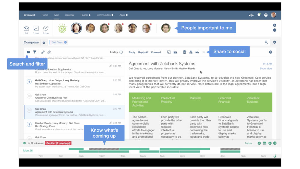
Here’s an early version of the Verse web client experience.
IBM Verse for iOS and Android
The Verse web client was about a year ahead when we started designing and building the mobile apps. We had a solution to synch to iOS Mail and an existing Android app already, but the only way to deliver the unique value of Verse was to build it ourselves.
Requirements
- Get the basics right. Deliver a complete mail, calendar, and contacts solution.
- Differentiate. Incorporate the unique value we were delivering on the server, but in a mobile-friendly manner.
- A natural fit. Primary targets were phones and tablets on iOS and Android.
- Make it secure. Build in support for third party mobile device management systems.
Process and Deliverables
Storyboards
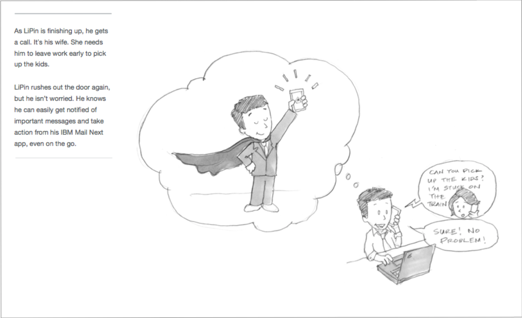
Our process included creating a complete storyboard from end to end, showing how a user goes about their day with our product. This method is great for aligning all teams and stakeholders around a goal and creates a lot of discussion. It has the added benefit of keeping the design team, who are responsible for different parts of the product on different platforms, in synch and aware of the overall picture.
Our team worked together to create the story flow and wireframes. One of our front-end developers, Jessica, made the drawings and came up with the mobile scenario of Lipin taking his father to the doctor.
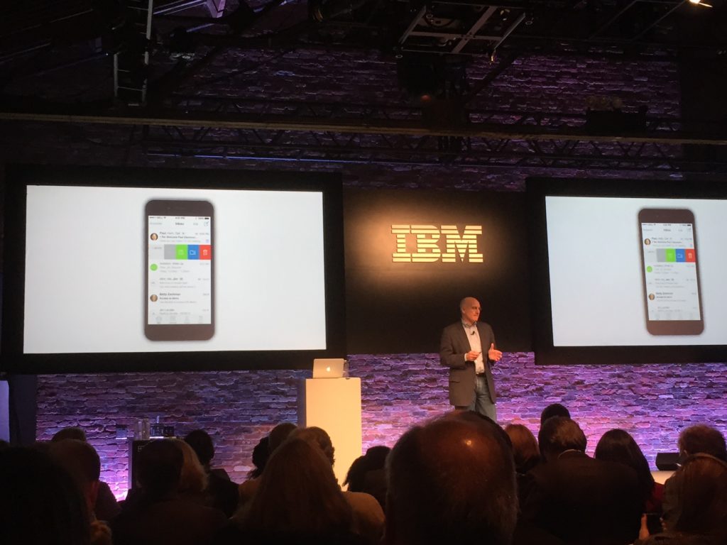
Vision Demo
One of the first things we had to do is create a complete demo for an IBM “Signature Event” – essentially a Verse launch event in New York. The only catch? There was no code ready to show!
The solution was to write the story and script, create hi-fidelity screens and animate it so it looked real for the event.
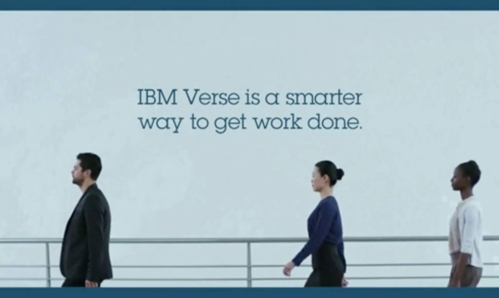
NFL Playoff TV Commercial
In that same year, we were asked to help out with a TV ad that would play during the U.S. NFL Playoff broadcasts in January 2015. The story shows a harried knowledge worker in the middle of a storm of people trying to get his attention. Verse helps him cut through noise to focus on what matters.
I worked with the agency contacts to fact check the script and provide images of the product to support the story, along with some sample animations of how it would work in real life on the iPad.
Wireframes
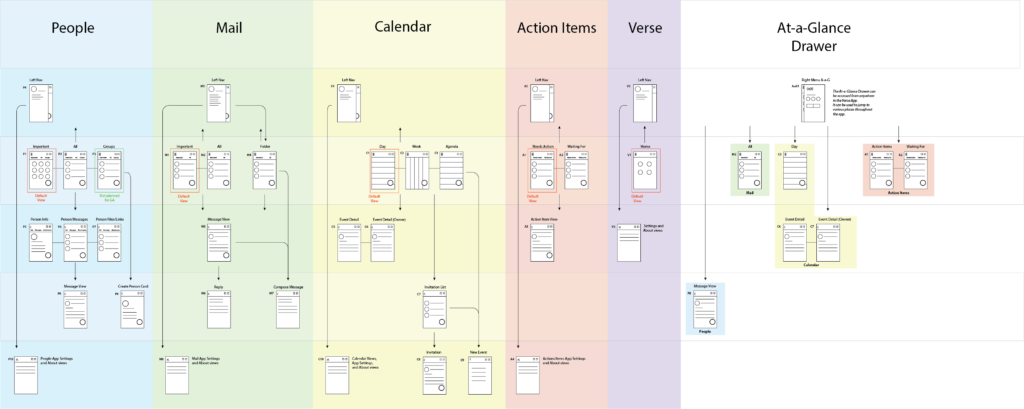
Typically, we explore design options in wireframe format. It’s a low-cost method for working through a user flow before deciding on a final solution.
The illustration at the right is the information architecture for the app. This helps get the overall view of the different parts that needed to be designed.
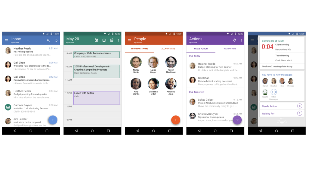
Android
Typically, we explore design options in wireframe format. It’s a low-cost method for working through a user flow before deciding on a final solution.
The Android Verse project began with an existing app that was in market. It already had an Inbox, Calendar, Contacts, and To-do’s but was in desperate need of a makeover to bring it up to date with the Material Design guidelines.
At one point, I had to stop the work so that we could step back and take a holistic view of the app. We then took 4-6 weeks to create style guidelines, document common patterns, and understand requirements. The development team had plenty to do with performance, bugs, and other server work. In the end, this allowed us to work faster to apply the styles and patterns to new designs for Verse.
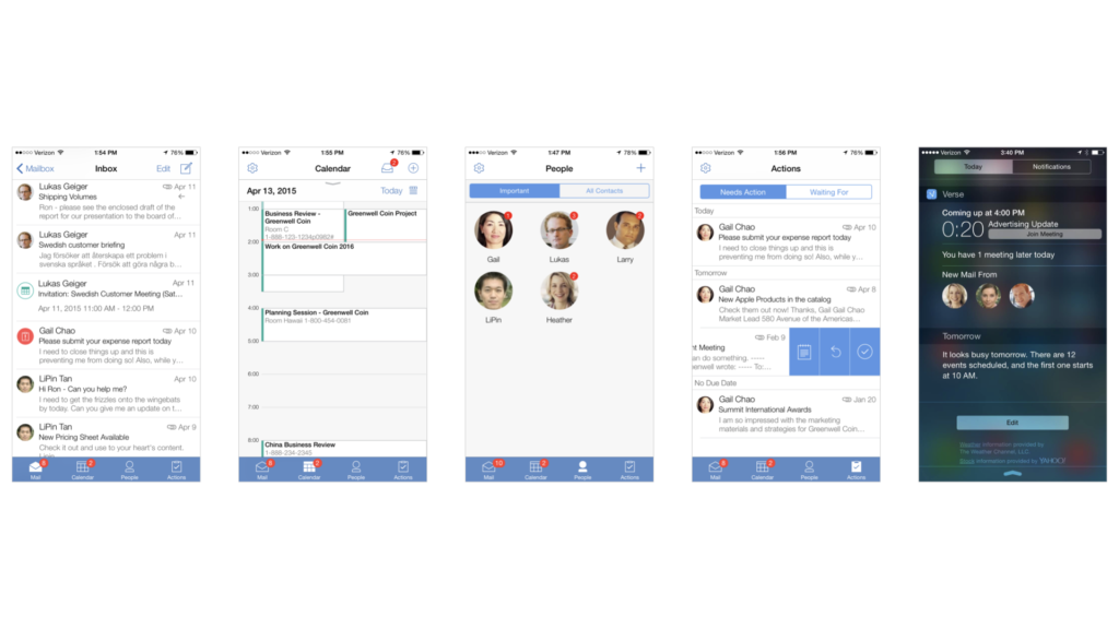
iOS
The iOS apps were completely new and had to be designed and built from scratch. There are four apps included: Mail, Calendar, People, and Actions.
One of the first decisions we had to make was whether to create multiple apps – one for each sub-section of function, like inbox and calendar – or combine them into one app. We talked to customers and other users to determine the answer. Surprisingly, most liked having their enterprise mail/calendar all in one app and separate from their personal mail.